
Hi Everyone!
We’re excited to launch Creative Clues, a new monthly feature of Art Starts at Louisville Visual Art. With each new Clue, we’ll provide some pointers to help you succeed and improve.
Creative Clues Showcase
CLUE: APPLES & PEARS
Deadline for artwork submission is September 30, 2021 at midnight
How to: Color Context 3.1
Color Context is the idea that color carries different meanings in different situations, and that color can emote different feelings, thoughts, and actions in different contexts. That is a lot of “differents”! How color behaves in relation to other colors and shapes is a complicated idea. Compare the contrast effects (the value effects) of different color backgrounds for the same lime green square below.

The lime green squares inside all of these boxes is the same color, but it doesn’t look like it, does it? The lime green square appears more brilliant against a black, what you are really seeing is the lightness in value in the lime green color. On the white background, you are seeing the darkness in value of the lime green color. In the gray square what you are seeing is the pure color of the lime green square – the value of this lime green color is the same as the larger gray square – the true color pops right out at you. It scintillates!

Different readings of the same color
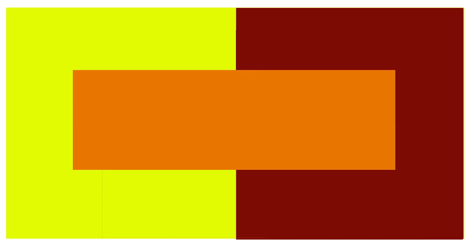
The small orange rectangle on the left appears to have a XXXXXXXX tinge when compared to the small orange rectangle on the right. They are both the same color as seen in the illustration below. It is three colors, but it looks like four.
Observing the effects colors have on each other, their relationships to each other, is the beginning of understanding color context. Look at all the different ways we see, feel and express with colors, and how colors react to each other.
What’s Behind the Mask?
Supplies:
• 11” x 17” sheet of colored construction paper (not black, white or gray)
• tempera or acrylic paints
• water and water bowl
• brush, hands, sponge, any tool to spread paint
• blue painter’s tape that removes easily
• scissors (optional)
• palette, paper or Styrofoam plate
Instructions:
Cut or tear small pieces of painter’s tape, about an inch square. Place the small pieces of painter’s tape all over the construction paper, they can be evenly spaced or randomly spaced on the page. When all of the painter’s tape is placed on the page prepare your palette and paints. Put a small dab of each color of paint on your palette. Let’s say you have seven different paints, try to mix fourteen new colors out of the seven. You should have twenty one paint colors. Now take all of those paints and paint them all over the 11” x 17” paper, going over the blue masked painter’s tape. Make sure to paint very dark and very light values, medium values, pure colors, complimentary colors and analogue colors, and blend them into each other all around the masked shapes. When the paint dries, gently take off the blue painter’s tape masks. Notice your paper color under the masks is untouched, but do all of the unmasked shapes look the same color?


Now remove the blue painter’s tape, and see if those construction paper squares (which are all exactly the same color) look any different from square to square!
Now let’s review our Color Theory Creative Clues from the past few months. Check out these colorful paintings, what can you see, feel, imagine?
• What color combinations can you find?
• How are the colors influencing the way you feel about the paintings?

Georgia O’Keefe, Lake George Reflection, 1921-22
This painting by Georgia O’Keefe is using many color combinations. What color combinations can you see? What are some words that describe this painting?

Josef Albers, Reversed Grounds, 1963
Look at this silkscreen by Josef Albers, an abstract painter and color theorist. What theories (or ideas), do you have about those two small peach squares? What are some words that describe this painting?

Jacob Lawrence, Street to Mbari, 1964
In this painting by Jacob Lawrence, can you see and feel the busyness on the street? What color combinations did the artist use to create this busy feeling? What are some words that describe this painting?
“In visual perception, a thing is never seen as it really is” Josef Albers
Send in your APPLES AND PEARS artwork
Deadline for artwork submission is September 29, 2021 at midnight.
Content: family friendly (LVA will determine if artwork is appropriate to share online.)
Ages 5 to 105!
Photo Guidelines: here is a nifty link, if you want to learn to take great pictures of your artwork
Consent and Permission: By filling out the form below, you give LVA permission to display your artwork and information in the Creative Clue Showcase. *NOTE: if you are under 18 years old, please have a parent or guardian complete the form.
Address: email artwork to: artstartshere@louisvillevisualart.org
Social Media: you may share your artwork on Instagram: #artwithinreach, #ArtStartsAtLVA
LVA will notify you if your artwork is in the Creative Clues Showcase at the end of the month. artstartshere@louisvillevisualart.org
Remember to use your past How To pages to come up with creative solutions for your new clue:
January 2021 - Winter -Thumbnails
February 2021 -Heart - Research
March 2021 - Chair - Develop Your Artist Eye
April 2021 - Spring
May 2021 - Breeze
June 2021 - Light
July 2021 - Together
August - Trees